|
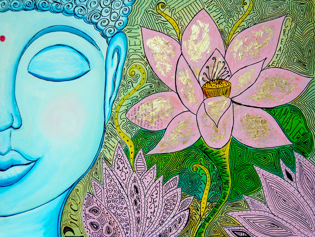
"Blueddah" 18x24 Acrylic, Sharper Marker, Gold Leaf on Canvas. This Blue Buddah, or "Blueddah" piece was created as a gift for my uncle for his 50th Birthday. I started the piece by sketching the face of a buddha onto the left side of the canvas. I knew I wanted a lotus on the right side, so I made that another focal point. At first I started trying to go for a more realistic style, but it was just not coming out how I had intended. I just naturally have a very bright, blocky, bold and whimsical style. So I decided to not force anything that did not come naturally and went along with how things were progressing. After I had the basic shapes blocked in with the colors I had chosen, I slightly rendered the Buddha, and left the flowers and leaves more blocky. I then inked the entire canvas in the zentangle style, and added some inspiring words throughout. Also, this was the first time I had ever used Gold Leaf. If I remember correctly, I just added some modge-podge glue to the lotus petals and then lightly pressed the gold leaf to the surface. It adhered pretty instantly. This is probably one of my favorite larger paintings that I have ever done, and my Uncle Billy LOVED it!
0 Comments
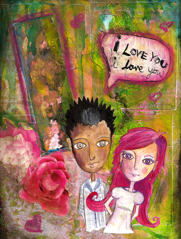
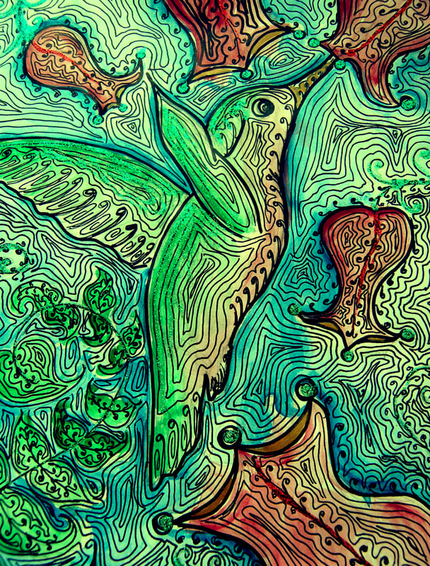
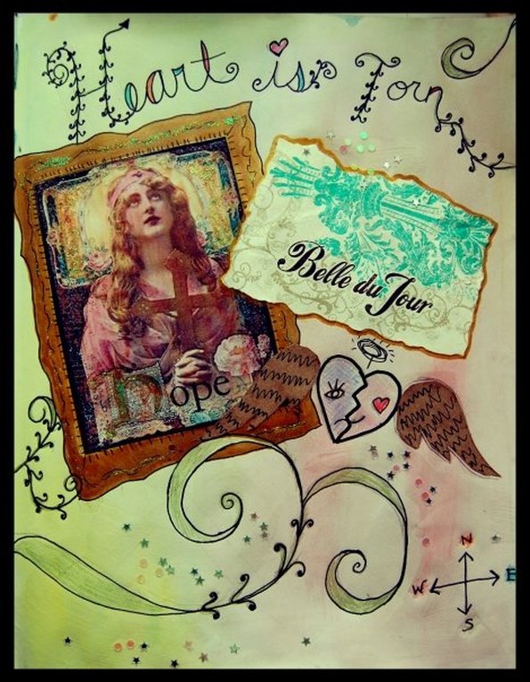
This was just a self portrait I did of me and my husband (boyfriend at the time I did this). I did this in 2011 or so. I actually did our portraits on a separate paper, in acrylics that I watered down and used like watercolors, along with watercolor pencils. I then cut us out of that paper, and put them aside. I then did the background of this piece in my sketchbook. It's very layered and textured. I modge-podged tissue paper and photo copies of some pages from favorite books of mine, and then brayered acrylic paints over those. Then I also did a transfer using some gel medium and a photocopied photo strip of us, that you can slightly see on the upper left hand side. It didn't come out exactly as I had hoped, but it was all good for experimental purposes. I had never done gel medium transfers before, so I'll definitely need a bit more practice with that. I believe I also used some pastels or charcoals to rub over the lines in the glue-dried tissue paper, to create a more textured look. I then had some rose magazine cutouts, and the "I Love You" speech bubble was also a magazine cutout. After the background was complete, I glued our figures that I had painted separately earlier, onto the page. And there you have it... This was all in all a very experimental piece. This sketch was done in acrylics , and I watered them down alot to give it that watercolor effect. All of the black ink was just freehand doodling. I saw a lot of Hummingbirds in LA, so they represent to me, that time in my life, where I spread my wings and was off on my own. "Heart is Torn" kind of represents for me, the decision to live in California versus the decision to move back home to New Jersey, hence the compass, and half heart happy, and half heart sad. I knew that it was good for me to experience all of the things I was experiencing, being on my own for the first time in my life, and pushing my music out into the west coast. I knew realistically though, LA was not the place for me, I literally went there with the clothes on my back , and a few bags. |
RECENT INSTAGRAM POSTSArchives
June 2018
Categories
All
|

 RSS Feed
